Thursday 31 May 2012

Ian Mitchell's Show Goes Up and New Drawings in the Studio

Last week, after spending 2 days dismantling and packing up the Nicholson exhibition, we spent the rest of the time hanging Ian Mitchell's show, A1(M) Eastern Gateway, in which he explores the idea of bulding a motorway from Thirsk to Whitby via Rosedale viaduct.  Ian has made works on a variety of substrates, the results of which are beautiful, playing on the differences between tough durable, modern surfaces and structures and the beauty of the landscape and ancient marks found on it.   Andy Dalton was around for most of the week, this is the final show he has worked on as gallery manager;  he has now left the museum and I miss him already.  Ian's show looks brilliant and we are all excited about this new development in his work.


 A few installation shots of Ian Mitchell's show, A1 (M) Eastern Gateway, which runs at The Gallery, Ryedale Folk Museum until 8th July.   http://easterngateway.blogspot.co.uk   and http://ianmitchellart.blogspot.co.uk

Ian is giving a talk at the gallery on June 15th, 7 - 8 pm.
www.thegalleryatryedalefolkmuseum.blogspot.com


I had been working on a drawing to give Andy as a gift for weeks but as usual the final touches were left to the last minute and I had to dash to finish it in my studio on the day of his leaving meal with colleagues from the museum. Andy has left to pursue his own printmaking and plans to set up a workshop in his garage.  I am looking forward to seeing some of the results.  www.andrew-dalton.com    He is a real star, so I drew him one:


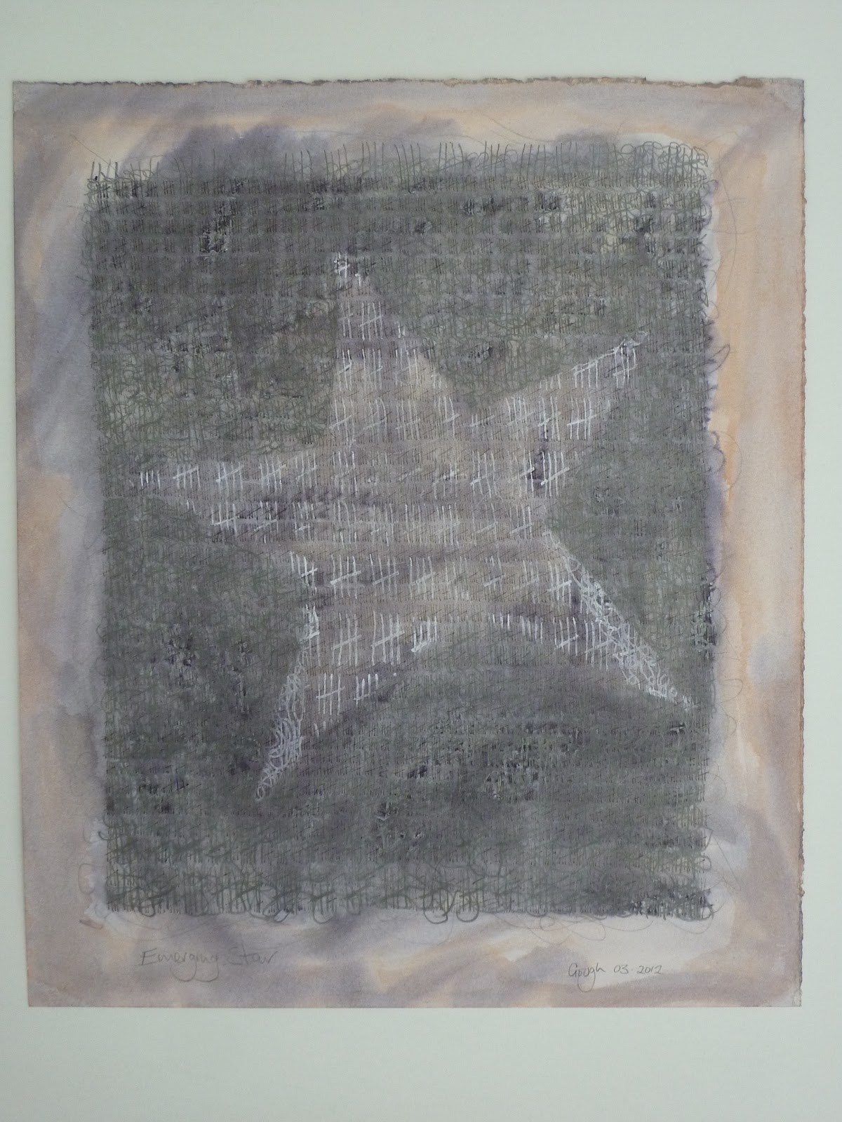
Emerging Star, May 2012


I have only managed to work on a single drawing so far this week as there were a few things related to The Gallery that needed seeing to.  This drawing is on cheap cartridge paper, which has caused me much agony; the graphite sticks just don't slide over the surface in the same delicious way that they do on the Arches paper I used for some of the previous drawings.  It is also much much whiter and there is less tooth to the surface, which is not as pleasing.  So, to counteract this I have drawn the marks on the paper and with each layer, I have washed over the drawing with some matchpots of off white emulsion paint that I have kicking around the studio.  This created an interesting ghostly revealed/concealed look, which made me think of memories lost or half remembered.  I find the subtlety of the marks made by the brush with the emulsion over the graphite really pleasing and fascinating but I am wary of becoming sucked in by the beauty of the surface too much.  My dilemma now is: do I leave this drawing as it is, keeping it for reference, and make another that I will continue to work on beyond this stage, with the other, more calligraphic marks to create the obelisk/human forms?


Photographs of exhibition A1 (M) Eastern Gateway with permission of Ian Mitchell

All other images copyright Sue Gough


Sunday 27 May 2012

The Importance of Good Quality Photographs to Document Work


Pete and I went to The Gallery, Ryedale Folk Museum last weekend, to take some exhibition shots of the Nicholson show before it came down on Monday in preparation for hanging Ian Mitchell's show. They will be part of the ongoing archival record of exhibitions at The Gallery.  Professor Gordon Bell also requested a copy of them for his own records.  Pete took the photo's, I made sure the space was tidy and was on hand to approve the shots! 

We then drove to my studio, where Pete photographed my latest work so that I have some  really good quality for my archive.  These are invaluable as, should I choose to submit work for exhibitions, good photographs are essential.  I am lucky to have such a helpful husband because it would cost me a lot of money to hire a photographer to do this for me.  Pete takes several exposures of each work, (fewer for black and white as there is less adjustment required) and we then spend time with the downloaded images, selecting the best one and adjusting the colour balance until it resembles as exactly as possible, the original.  We have to have the original there with us to refer to while we go through this process, which, now that my studio is no longer at home, means a lot of lugging work backwards and forwards, but it is worth it.  For those of you reading this who are interested, the software Pete uses along with a Huey screen callibrator is Nikon's NX2 software because he has a Nikon camera, which does the same job as Photoshop.


Study, re-worked canvas

 
I visited Anthony Bentley of Ginger Hall Framing, Kirkbymoorside last week to discuss framing of some of my large drawings.  As usual, Anthony was really  helpful and interesting on the subject.  Now that the photo's are taken, I need to get them framed to protect them.  I envisage plain square frames, white or wood washed with white, with the drawings floated on a back paper or board, which will show the deckle edges of the paper off and present the drawings really well.


The Departed # 1


The Departed # 1V


I bubble wrap all my work for storage on the racks I have at home and a really helpful reference is to have a label on the outside of each package, which has an image of the work as well as the dimensions and any relevant information about it.  This makes it easier to select the correct image from a series that are all the same size without having to unwrap each one.  The good images can be viewed on screen by any interested parties, selected and found on the rack much more quickly by checking the label and may be unwrapped for closer inspection. 

 It is useful to document work as it progresses, which I do with my Lumix digital camera, many of which I put up on this blog but for the finished pieces, a good quality record is an important marketing tool.   Keeping an archive of high quality images of the work is vital, because, who knows, one day I may actually sell some and the original image will  no longer be around for me to look at.

These images are also useful when looking back at the development of the work and working process/practice, they may also provide a useful reference when developing new work.


All are images copyright of the artist

Tuesday 15 May 2012

Working again at last!


The partition wall and the false walls at the back are complete, ready for me to cover in work!


Shelving and trestle table more or less in the right place, one more set of shelves to bring over.  Still got to bring my mangle and another old door that I use as a table top with trestles over from the house.

Apart from a few small gaps in the walls and around the doors to fill, the studio is finally ready and I have been able to continue my work.  I really like the space, the light will be ok during the summer months and I am going to get some more strip lights installed before the nights start to draw in again.  I have one calor gas stove in preparation for the cold months, but suspect I may need another.  The chickens are still nosy and come for a peer in if I leave the studio door open, and I never leave the boot of my car open because they seem to like hopping up inside for a root around.

Still, all in all I am happy to have the new space up and running, my working routine will soon settle down and I shall be able to concentrate properly again. 
Life does have a way of interrupting the flow though: this week I have several appointments that are going to disrupt things and next week I shall be in The Gallery, Ryedale Folk Museum all week taking down the Nicholson show and intalling Ian Mitchell's exciting new work.  Andy Dalton and I are really looking forward to seeing his work in the space; what we have seen so far is really good stuff.  Ian has taken the opportunity of the show to develop and push his ideas and working practice, which is what The Gallery is for.  Contemporary artists in this rural area need a space that provides them with support and encouragement to develop their ideas and take risks with new work. 
www.thegalleryatryedalefolkmuseum.blogspot.com

www.ianmitchellart.com


There are some potentially exciting developments for Ryedale ArtWorks in the offing, I am really looking forward to working with the team to see what we can achieve.  RAW is hoping to broaden it's horizons to provide more opportunities for exhibiting among other things, so these are exciting times and there will be lots to do.
www.ryedaleartworks.com


I have continued to experiment with the bottles with the metal tips that allow me to draw with the paint.  I have used an old canvas that was not successful for this; the paint I mixed is slightly thicker than the last lot and unfortunately it clogged.  I am not sure whether this is because I didn't mix it smoothly enough or if, because some of the paint is quite old, there may have been some skin that I caught up by mistake.  I shall have to take more care next time.  The clogging caused me to have to stop mid line, which entailed much loud swearing on my part; I just hope Sally Taylor, who is in the space above me was not in at the time!  The break in my line was frustrating, but when I looked at the work a day later, having gone over the work again to adjust the tonal value of the drawn area, it didn't actually matter.   


The tonal qualities of the drawings is an integral part of the image and meaning and contributes to the success of the work.  With the paintings this is much more difficult to achieve; I have found a way to draw with the paint that is quite successful but with paint comes a whole other set of things to consider.  Paint equals colour, which adds another dimension and distraction to expressing an idea.  Tonal qualities of paint are complicated by the colours selected, which affects the meaning/idea.  It is easy to create tonal contrast by using primaries or secondary colours, but I prefer the more sublte tertiaries.  I keep a rough record of the colours I mix in a sketch book and am constantly on the look out for interesting colour combinations when I am out and about in the landscape.  Light, especially stormy light creates a wonderfully expressive contrast of colour and tone.


I think this colour combination is a bit too obvious!


I am continuing to experiment with way to express the ideas of time passing and the human condition some of which are more successful than others.  I think the drawing with paint is a little "tight", I prefer more gestural use of paint but it has been a useful stage of the process.  I am looking forward to the continued struggle, finding a successful way to express time/seasons, loss and optimism.  One thing I do know; sometimes the simplest things are the best so I need to find ways to express things in an enigmatic way, to allude to the meaning and allow the paint to take over, to have less control.